交互设计师在设计线框图原型时,熟知常见的web设计模式很有帮助,做到“心中有数”才能创造出符合需求,用户易学易用的界面来。所谓“没有必要重复发明轮子”,模式往往容易解决常见问题,正确的模式能帮用户熟悉界面、提高效率。
常见的UI设计模式如下图:
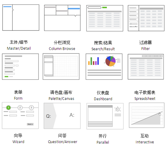
下面分别进行具体分析,遇到不同需求的时候就可以选择合适UI设计模式。
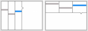
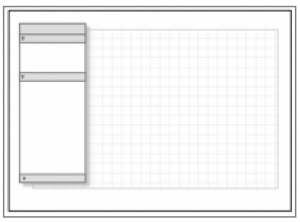
01.主体/细节(Master/Detail)模式
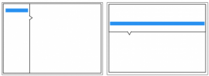
主体/细节模式可以分为横向和纵向两种。如果想让用户在同一页面下,引导他们在类目下高效地切换,这无疑是一种理想的方式。如果主体信息对于用户来说更重要,最好选择横向布局。或是主体部分不仅条目多而且包含信息也多,那也该选择这种横向布局。
举例来说:
Windows窗口属于纵向排布
Mac mail的横向排布
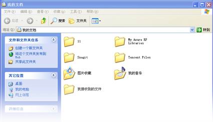
0.2分栏浏览
分栏浏览也分为横向和纵向两种。用户可以通过它,选择不同的类别点进并逐步引导用户找到需要的信息。
举例:
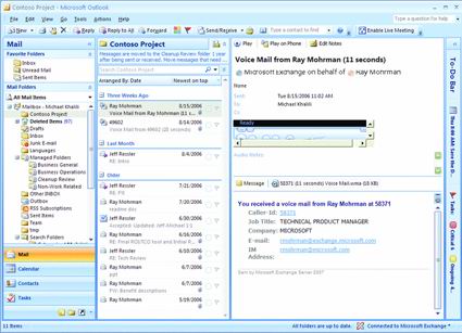
Outlook采用逐级分栏的界面,用户可以选择进入“收件箱”――>“某封收件”――>“具体邮件内容”
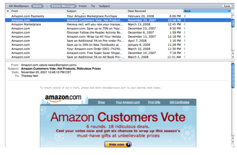
0.3搜索/结果
搜索屏幕模式对于想快速、直接看到具体结果的用户来说非常便捷。从很简单的到非常复杂的都有。
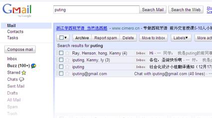
Gmail采用简单搜索
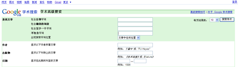
而对于google学术的用户,高级搜索限定更复杂的搜索条件会提炼出用户更期望得到的信息。
0.4过滤数据组
分为横向和纵向。开始定义一些已知信息,之后通过限定条件对搜索后的结果进行再过滤。
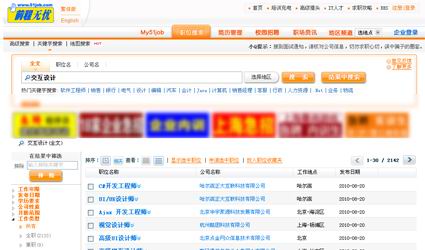
51job用户在使用简单搜索输入所需职位后,纵向布局的左边面板提供诸如“发布时间、薪金”等条件,进一步优化信息
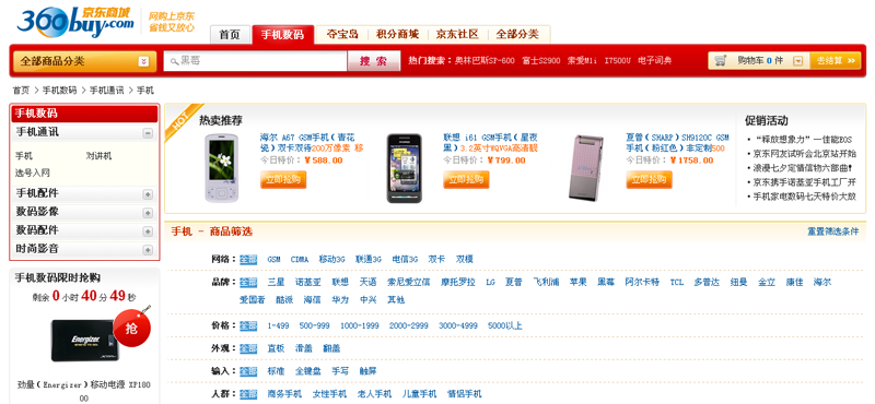
以京东为例,多数电子商务网站在用户初步模糊搜索后,提供进一步优化的过滤条件。上图中,京东采用的是横向排列方式
0.5表单
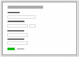
表单类型众多,也是最能体现用户体验是否良好的地方。其中包含很多内容,推荐专门介绍表单的书:《Web Form
Design: Filling in the Blanks》。
注册信息一般使用表单
0.6调色盘/画布
调色盘/画布虽然不算最常见模式,但它对于创造图形类文档有着不可替代的优势:比如设计线性或非线性图;流程图;页面布局;制定物理大小的设计/图表或控制布局。
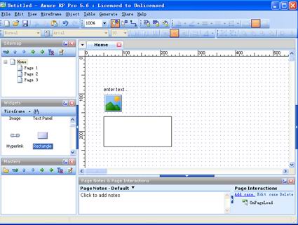
对于设计师来说调色盘/画布这种模式并不陌生,常用软件,例如:Axure、ps都是采用这种方式。
0.7仪表盘

一个设计完善的仪表盘应提供:一目了然的关键信息,实时数据,易读的图形和操作,清晰的入口和浏览。理论上讲,在一个屏幕下展示复杂的数据本身就很难。
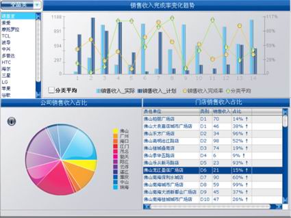
之前我用水晶易表为苏宁电器做的实时监控各个地区门店销售系统仪表盘
0.8电子表格
方便用户快速浏览,编辑大板块信息的理想模式。电子表格需要提供下列功能:标准的表格(诸如分类,隐藏/显示栏目,重列栏目,分组(如果可以)),全局撤销/重做,增加/插入/删除排,键盘导航,导入和导出。
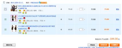
淘宝购物车选择使用电子表格,可以让用户对已选商品进行快速编辑(增加/减少数量,删除等)
0.9向导
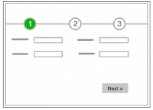
对于复杂的或是不常见的流程,向导/快速启动屏幕模式可以有效地导航。
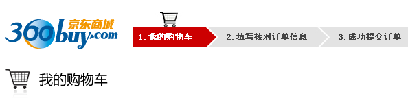
京东上使用wizard快速引导不熟悉流程的顾客完成付款
0.10.Q&A
Q&A模式是指用户通过选取相符条件,从而自主找到适合自己的解决方案。Q&A不同于搜索模式,它通常需要了解用户基础上,通过提问来帮助用户弄清他们缺乏经验的在哪里(比如健康保险,抵押,计划,购买)有哪些可供的选择或建议。
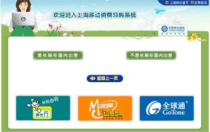
上海移动资费导购系统可以让用户通过回答几个问题,可以建议用户选择哪种话费套餐
0.11.平行面板
平行面板屏幕模式可以收起(一次只显示一个),也可以展开(同时显示全部)。这种模式适合组织大量类似或相互影响的信息,让用户在同一页面更高效的获得信息。最佳应用在:需要申请者需要填写各种没有顺序的类别目录。
0.12.交互模型
交互模型屏幕模式应用在很多交互要素需要与关键项目(比如日历、地图、图标、画布等)进行交互的时候。是一种用户体验更贴近用户心智模型的模式。在日历、地图、线状图、预设可能场景分析(包括计算器),所见即所得编辑器(包括图片处理)时应用效果非常好。
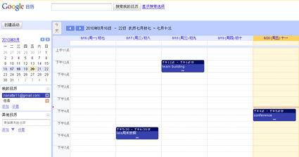
Google的calendar在日历上可以直接编辑提示内容
附加:13.空白状态
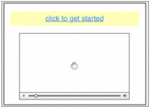
空白状态指在任何数据输入或进入系统前,应用的自然状态。Getting real 一书曾说空白状态的屏幕使得用户更期待。通过给用户一种预览来降低担心、沮丧和犹豫。空白状态屏幕包括:视频,快速教程,帮助提示,安装后的截图。
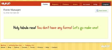
Wufoo是一个在线表单设计网站,初始后会引导用户建立表单
14.其他模式
还有两种广泛使用但在企业软件很少使用的模式。
- 门户:如果你是市场调研专家,商业需求分析师和用户反馈调研员设计门户,可以参考控制面板的设计规范和案例。
- Tabs:其实Tab是一种部件,不是一种模式。它为在多种同语境下的数据提供多选一选择。如果数据结构导致你的设计tab显得很多。有两个小建议:第一,重新考虑架构。通过使用卡片分类或请教一名专业的信息架构师;第二,可以参考平行面板的规范和案例。
参考文献:《Designing interfaces》and 《Designing web interfaces》
| 

