| 编辑推荐: |
本文首先介绍了Flutter中构建UI界面最常用的基础组件(容器,行,列,绝对定位布局,文本,图片和图标)用法。接着,介绍了一个较复杂的UI实战例子。希望能对您有所帮助。
本文来自于segmentfault,由火龙果软件Alice编辑、推荐。 |
|
1. 前言
Flutter作为时下最流行的技术之一,凭借其出色的性能以及抹平多端的差异优势,早已引起大批技术爱好者的关注,甚至一些闲鱼,美团,腾讯等大公司均已开始使用。虽然目前其生态还没有完全成熟,但身靠背后的Google加持,其发展速度已经足够惊人,可以预见将来对Flutter开发人员的需求也会随之增长。
无论是为了现在的技术尝鲜还是将来的潮流趋势,都9102年了,作为一个前端开发者,似乎没有理由不去尝试它。正是带着这样的心理,笔者也开始学习Flutter,同时建了一个用于练习的仓库,后续所有代码都会托管在上面,欢迎star,一起学习。这是我写的Flutter系列文章:
用Flutter构建漂亮的UI界面 - 基础组件篇
Flutter滚动型容器组件 - ListView篇
Flutter网格型布局 - GridView篇
在Flutter中使用自定义Icon
今天分享的是Flutter中最常用到的一些基础组件,它们是构成UI界面的基础元素:容器,行,列,绝对定位布局,文本,图片和图标等。
2. 基础组件
2.1 Container(容器组件)
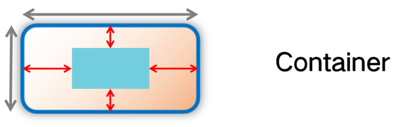
容器组件
Container组件是最常用的布局组件之一,可以认为它是web开发中的div,rn开发中的View。其往往可以用来控制大小、背景颜色、边框、阴影、内外边距和内容排列方式等。我们先来看下其构造函数:
Container({
Key key,
double width,
double height,
this.margin,
this.padding,
Color color,
this.alignment,
BoxConstraints constraints,
Decoration decoration,
this.foregroundDecoration,
this.transform,
this.child,
}) |
2.1.1 width,height,margin,padding
这些属性的含义和我们已经熟知的并没有区别。唯一需要注意的是,margin和padding的赋值不是一个简单的数字,因为其有left,
top, right, bottom四个方向的值需要设置。Flutter提供了EdgeInsets这个类,帮助我们方便地生成四个方向的值。通常情况下,我们可能会用到EdgeInsets的4种构造方法:
EdgeInsets.all(value): 用于设置4个方向一样的值;
EdgeInsets.only(left: val1, top: val2, right: val3,
bottom: val4): 可以单独设置某个方向的值;
EdgeInsets.symmetric(horizontal: val1, vertical: val2):
用于设置水平/垂直方向上的值;
EdgeInsets.fromLTRB(left, top, right, bottom): 按照左上右下的顺序设置4个方向的值。
2.1.2 color
该属性的含义是背景颜色,等同于web/rn中的backgroundColor。需要注意的是Flutter中有一个专门表示颜色的Color类,而非我们常用的字符串。不过我们可以非常轻松地进行转换,举个栗子:
在web/rn中我们会用'#FF0000'或'red'来表示红色,而在Flutter中,我们可以用Color(0xFFFF0000)或Colors.red来表示。
2.1.3 alignment
该属性是用来决定Container组件的子组件将以何种方式进行排列(PS:再也不用为怎么居中操心了)。其可选值通常会用到:
Alignment.topLeft: 左上
Alignment.topCenter: 上中
Alignment.topRight: 右上
Alignment.centerLeft: 左中
Alignment.center: 居中
Alignment.centerRight: 右中
Alignment.bottomLeft: 左下
Alignment.bottomCenter: 下中
Alignment.bottomRight: 右下
2.1.4 constraints
在web/rn中我们通常会用minWidth/maxWidth/minHeight/maxHeight等属性来限制容器的宽高。在Flutter中,你需要使用BoxConstraints(盒约束)来实现该功能。
// 容器的大小将被限制在[100*100
~ 200*200]内
BoxConstraints(
minWidth: 100,
maxWidth: 200,
minHeight: 100,
maxHeight: 200,
) |
2.1.5 decoration
该属性非常强大,字面意思是装饰,因为通过它你可以设置边框,阴影,渐变,圆角等常用属性。BoxDecoration继承自Decoration类,因此我们通常会生成一个BoxDecoration实例来设置这些属性。
1) 边框
可以用Border.all构造函数直接生成4条边框,也可以用Border构造函数单独设置不同方向上的边框。不过令人惊讶的是官方提供的边框竟然不支持虚线(issue在这里)。
// 同时设置4条边框:1px粗细的黑色实线边框
BoxDecoration(
border: Border.all(color: Colors.black, width:
1, style: BorderStyle.solid)
)
// 设置单边框:上边框为1px粗细的黑色实线边框,
右边框为1px粗细的红色实线边框
BoxDecoration(
border: Border(
top: BorderSide(color: Colors.black, width:
1, style: BorderStyle.solid),
right: BorderSide(color: Colors.red, width:
1, style: BorderStyle.solid),
),
) |
2) 阴影
阴影属性和web中的boxShadow几乎没有区别,可以指定x,y,blur,spread,color等属性。
BoxDecoration(
boxShadow: [
BoxShadow(
offset: Offset(0, 0),
blurRadius: 6,
spreadRadius: 10,
color: Color.fromARGB(20, 0, 0, 0),
),
],
) |
3) 渐变
如果你不想容器的背景颜色是单调的,可以尝试用gradient属性。Flutter同时支持线性渐变和径向渐变:
// 从左到右,红色到蓝色的线性渐变
BoxDecoration(
gradient: LinearGradient(
begin: Alignment.centerLeft,
end: Alignment.centerRight,
colors: [Colors.red, Colors.blue],
),
)
// 从中心向四周扩散,红色到蓝色的径向渐变
BoxDecoration(
gradient: RadialGradient(
center: Alignment.center,
colors: [Colors.red, Colors.blue],
),
) |
4) 圆角
通常情况下,你可能会用到BorderRadius.circular构造函数来同时设置4个角的圆角,或是BorderRadius.only构造函数来单独设置某几个角的圆角:
// 同时设置4个角的圆角为5
BoxDecoration(
borderRadius: BorderRadius.circular(5),
)
// 设置单圆角:左上角的圆角为5,右上角的圆角为10
BoxDecoration(
borderRadius: BorderRadius.only(
topLeft: Radius.circular(5),
topRight: Radius.circular(10),
),
) |
2.1.6 transform
transform属性和我们在web/rn中经常用到的基本也没有差别,主要包括:平移,缩放、旋转和倾斜。在Flutter中,封装了矩阵变换类Matrix4帮助我们进行变换:
translationValues(x, y, z): 平移x, y, z;
rotationX(radians): x轴旋转radians弧度;
rotationY(radians): y轴旋转radians弧度;
rotationZ(radians): z轴旋转radians弧度;
skew(alpha, beta): x轴倾斜alpha度,y轴倾斜beta度;
skewX(alpha): x轴倾斜alpha度;
skewY(beta): y轴倾斜beta度;
2.1.7 小结
Container组件的属性很丰富,虽然有些用法上和web/rn有些许差异,但基本上大同小异,所以过渡起来也不会有什么障碍。另外,由于Container组件是单子节点组件,也就是只允许子节点有一个。所以在布局上,很多时候我们会用Row和Column组件进行行/列布局。
2.2 Row/Column(行/列组件)
行/列组件
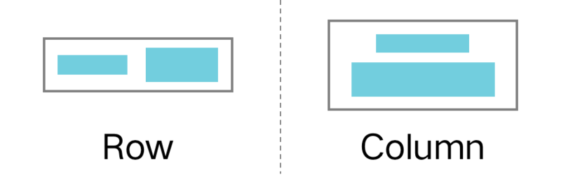
Row和Column组件其实和web/rn中的Flex布局(弹性盒子)特别相似,或者我们可以就这么理解。使用Flex布局的同学对主轴和次轴的概念肯定都已经十分熟悉,Row组件的主轴就是横向,Column组件的主轴就是纵向。且它们的构造函数十分相似(已省略不常用属性):
Row({
Key key,
MainAxisAlignment mainAxisAlignment = MainAxisAlignment.start,
CrossAxisAlignment crossAxisAlignment = CrossAxisAlignment.center,
MainAxisSize mainAxisSize = MainAxisSize.max,
List<Widget> children = const <Widget>[],
})
Column({
Key key,
MainAxisAlignment mainAxisAlignment = MainAxisAlignment.start,
CrossAxisAlignment crossAxisAlignment = CrossAxisAlignment.center,
MainAxisSize mainAxisSize = MainAxisSize.max,
List<Widget> children = const <Widget>[],
}) |
2.2.1 mainAxisAlignment
该属性的含义是主轴排列方式,根据上述构造函数可以知道Row和Column组件在主轴方向上默认都是从start开始,也就是说Row组件默认从左到右开始排列子组件,Column组件默认从上到下开始排列子组件。
当然,你还可以使用其他的可选值:
MainAxisAlignment.start
MainAxisAlignment.end
MainAxisAlignment.center
MainAxisAlignment.spaceBetween
MainAxisAlignment.spaceAround
MainAxisAlignment.spaceEvenly
2.2.2 crossAxisAlignment
该属性的含义是次轴排列方式,根据上述构造函数可以知道Row和Column组件在次轴方向上默认都是居中。
这里有一点需要特别注意:由于Column组件次轴方向上(即水平)默认是居中对齐,所以水平方向上不会撑满其父容器,此时需要指定CrossAxisAlignment.stretch才可以。
另外,crossAxisAlignment其他的可选值有:
crossAxisAlignment.start
crossAxisAlignment.end
crossAxisAlignment.center
crossAxisAlignment.stretch
crossAxisAlignment.baseline
2.2.3 mainAxisSize
字面意思上来说,该属性指的是在主轴上的尺寸。其实就是指在主轴方向上,是包裹其内容,还是撑满其父容器。它的可选值有MainAxisSize.min和MainAxisSize.max。由于其默认值都是MainAxisSize.max,所以主轴方向上默认大小都是尽可能撑满父容器的。
2.2.4 小结
由于Row/Column组件和我们熟悉的Flex布局非常相似,所以上手起来非常容易,几乎零学习成本。
2.3 Stack/Positoned(绝对定位布局组件)
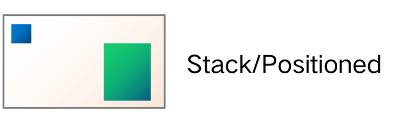
绝对定位布局组件
绝对定位布局在web/rn开发中也是使用频率较高的一种布局方式,Flutter也提供了相应的组件实现,需要将Stack和Positioned组件搭配在一起使用。比如下方的这个例子就是创建了一个黄色的盒子,并且在其四个角落放置了4个红色的小正方形。Stack组件就是绝对定位的容器,Positioned组件通过left,top
,right,bottom四个方向上的属性值来决定其在父容器中的位置。
Container(
height: 100,
color: Colors.yellow,
child: Stack(
children: <Widget>[
Positioned(
left: 10,
top: 10,
child: Container(width: 10, height: 10, color:
Colors.red),
),
Positioned(
right: 10,
top: 10,
child: Container(width: 10, height: 10, color:
Colors.red),
),
Positioned(
left: 10,
bottom: 10,
child: Container(width: 10, height: 10, color:
Colors.red),
),
Positioned(
right: 10,
bottom: 10,
child: Container(width: 10, height: 10, color:
Colors.red),
),
],
),
) |
2.4 Text(文本组件)
Text组件也是日常开发中最常用的基础组件之一,我们通常用它来展示文本信息。来看下其构造函数(已省略不常用属性):
const Text(
this.data, {
Key key,
this.style,
this.textAlign,
this.softWrap,
this.overflow,
this.maxLines,
}) |
data: 显示的文本信息;
style: 文本样式,Flutter提供了一个TextStyle类,最常用的fontSize
,fontWeight ,color,backgroundColor和shadows等属性都是通过它设置的;
textAlign: 文字对齐方式,常用可选值有TextAlign的left,right,center和justify;
softWrap: 文字是否换行;
overflow: 当文字溢出的时候,以何种方式处理(默认直接截断)。可选值有TextOverflow的clip,fade,ellipsis和visible;
maxLines: 当文字超过最大行数还没显示完的时候,就会根据overflow属性决定如何截断处理。
Flutter的Text组件足够灵活,提供了各种属性让我们定制,不过一般情况下,我们更多地只需下方几行代码就足够了:
Text(
'这是测试文本',
style: TextStyle(
fontSize: 13,
fontWeight: FontWeight.bold,
color: Color(0xFF999999),
),
) |
除了上述的应用场景外,有时我们还会遇到富文本的需求(即一段文本中,可能需要不同的字体样式)。比如在一些UI设计中经常会遇到表示价格的时候,¥符号比金额的字号小点。对于此类需求,我们可以用Flutter提供的Text.rich构造函数来创建相应的文本组件:
Text.rich(TextSpan(
children: [
TextSpan(
'¥',
style: TextStyle(
fontSize: 12,
color: Color(0xFFFF7528),
),
),
TextSpan(
'258',
style: TextStyle(
fontSize: 15,
color: Color(0xFFFF7528),
),
),
]
)) |
2.5 Image(图片组件)

Image图片组件作为丰富内容的基础组件之一,日常开发中的使用频率也非常高。看下其构造函数(已省略不常用属性):
Image({
Key key,
@required this.image,
this.width,
this.height,
this.color,
this.fit,
this.repeat = ImageRepeat.noRepeat,
}) |
image: 图片源,最常用到主要有两种(AssetImage和NetworkImage)。使用AssetImage之前,需要在pubspec.yaml文件中声明好图片资源,然后才能使用;而NextworkImage指定图片的网络地址即可,主要是在加载一些网络图片时会用到;
width: 图片宽度;
height: 图片高度;
color: 图片的背景颜色,当网络图片未加载完毕之前,会显示该背景颜色;
fit: 当我们希望图片根据容器大小进行适配而不是指定固定的宽高值时,可以通过该属性来实现。其可选值有BoxFit的fill,contain,cover,fitWidth,fitHeight,none和scaleDown;
repeat: 决定当图片实际大小不足指定大小时是否使用重复效果。
另外,Flutter还提供了Image.network和Image.asset构造函数,其实是语法糖。比如下方的两段代码结果是完全一样的:
Image(
image: NetworkImage('https://ss1.bdstatic.com
/70cFuXSh_Q1YnxGkpoWK1HF6hhy/it/u=1402367109,
4157195964&fm=27&gp=0.jpg'),
width: 100,
height: 100,
)
Image.network(
'https://ss1.bdstatic.com/70cFuXSh_Q1Ynx
GkpoWK1HF6hhy/it/u=1402367109,4157195964&
fm=27&gp=0.jpg',
width: 100,
height: 100,
) |
2.6 Icon(图标组件)
Icon图标组件相比于图片有着放大不会失真的优势,在日常开发中也是经常会被用到。Flutter更是直接内置了一套Material风格的图标(你可以在这里预览所有的图标类型)。看下构造函数:
const Icon(
this.icon, {
Key key,
this.size,
this.color,
}) |
icon: 图标类型;
size: 图标大小;
color: 图标颜色。
3. 布局实战
通过上一节的介绍,我们对Container,Row,Column,Stack,Positioned,Text,Image和Icon组件有了初步的认识。接下来,就让我们通过一个实际的例子来加深理解和记忆。

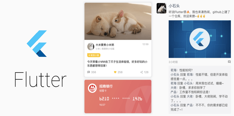
3.1 准备工作 - 数据类型
根据上述卡片中的内容,我们可以定义一些字段。为了规范开发流程,我们先给卡片定义一个数据类型的类,这样在后续的开发过程中也能更好地对数据进行Mock和管理:
/// 发布内容
final String publishContent;
/// 回复数量
final int replies;
/// 喜欢数量
final int likes;
/// 分享数量
final int shares;
const PetCardViewModel({
this.coverUrl,
this.userImgUrl,
this.userName,
this.description,
this.topic,
this.publishTime,
this.publishContent,
this.replies,
this.likes,
this.shares,
});
} |
3.2 搭建骨架,布局拆分
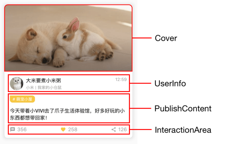
根据给的视觉图,我们可以将整体进行拆分,一共划分成4个部分:Cover,UserInfo,PublishContent和InteractionArea。为此,我们可以搭起代码的基本骨架:
class PetCard
extends StatelessWidget {
final PetCardViewModel data;
const PetCard({
Key key,
this.data,
}) : super(key: key);
Widget renderCover() {
}
Widget renderUserInfo() {
}
Widget renderPublishContent() {
}
Widget renderInteractionArea() {
}
@override
Widget build(BuildContext context) {
return Container(
margin: EdgeInsets.all(16),
decoration: BoxDecoration(
color: Colors.white,
borderRadius: BorderRadius.circular(8),
boxShadow: [
BoxShadow(
blurRadius: 6,
spreadRadius: 4,
color: Color.fromARGB(20, 0, 0, 0),
),
],
),
child: Column(
crossAxisAlignment: CrossAxisAlignment.stretch,
children: <Widget>[
this.renderCover(),
this.renderUserInfo(),
this.renderPublishContent(),
this.renderInteractionArea(),
],
),
);
}
} |
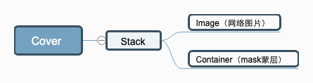
3.3 封面区域
为了更好的凸现图片的效果,这里加了一个蒙层,所以此处刚好可以用得上Stack/Positioned布局和LinearGradient渐变,Dom结构如下:
Widget renderCover()
{
return Stack(
fit: StackFit.passthrough,
children: <Widget>[
ClipRRect(
borderRadius: BorderRadius.only(
topLeft: Radius.circular(8),
topRight: Radius.circular(8),
),
child: Image.network(
data.coverUrl,
height: 200,
fit: BoxFit.fitWidth,
),
),
Positioned(
left: 0,
top: 100,
right: 0,
bottom: 0,
child: Container(
decoration: BoxDecoration(
gradient: LinearGradient(
begin: Alignment.topCenter,
end: Alignment.bottomCenter,
colors: [
Color.fromARGB(0, 0, 0, 0),
Color.fromARGB(80, 0, 0, 0),
],
),
),
),
),
],
);
} |
3.4 用户信息区域
用户信息区域就非常适合使用Row和Column组件来进行布局,Dom结构如下:
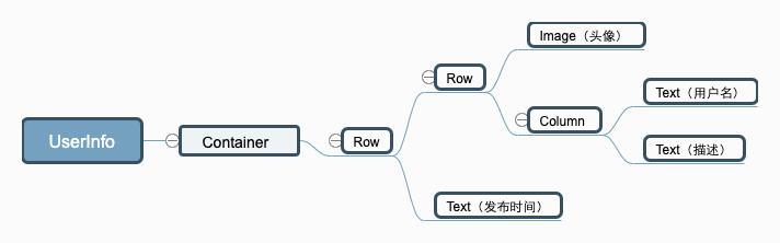
Widget renderUserInfo()
{
return Container(
margin: EdgeInsets.only(top: 16),
padding: EdgeInsets.symmetric(horizontal: 16),
child: Row(
crossAxisAlignment: CrossAxisAlignment.start,
mainAxisAlignment: MainAxisAlignment.spaceBetween,
children: <Widget>[
Row(
children: <Widget>[
CircleAvatar(
radius: 20,
backgroundColor: Color(0xFFCCCCCC),
backgroundImage: NetworkImage(data.userImgUrl),
),
Padding(padding: EdgeInsets.only(left: 8)),
Column(
crossAxisAlignment: CrossAxisAlignment.start,
children: <Widget>[
Text(
data.userName,
style: TextStyle(
fontSize: 15,
fontWeight: FontWeight.bold,
color: Color(0xFF333333),
),
),
Padding(padding: EdgeInsets.only(top: 2)),
Text(
data.description,
style: TextStyle(
fontSize: 12,
color: Color(0xFF999999),
),
),
],
),
],
),
Text(
data.publishTime,
style: TextStyle(
fontSize: 13,
color: Color(0xFF999999),
),
),
],
),
);
} |
3.5 发布内容区域
通过这块区域的UI练习,我们可以实践Container组件设置不同的borderRadius,以及Text组件文本内容超出时的截断处理,Dom结构如下:
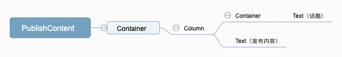
Widget renderPublishContent()
{
return Container(
margin: EdgeInsets.only(top: 16),
padding: EdgeInsets.symmetric(horizontal: 16),
child: Column(
crossAxisAlignment: CrossAxisAlignment.start,
children: <Widget>[
Container(
margin: EdgeInsets.only(bottom: 14),
padding: EdgeInsets.symmetric(horizontal: 8, vertical:
2),
decoration: BoxDecoration(
color: Color(0xFFFFC600),
borderRadius: BorderRadius.only(
topRight: Radius.circular(8),
bottomLeft: Radius.circular(8),
bottomRight: Radius.circular(8),
),
),
child: Text(
'# ${data.topic}',
style: TextStyle(
fontSize: 12,
color: Colors.white,
),
),
),
Text(
data.publishContent,
maxLines: 2,
overflow: TextOverflow.ellipsis,
style: TextStyle(
fontSize: 15,
fontWeight: FontWeight.bold,
color: Color(0xFF333333),
),
),
],
),
);
} |
3.6 互动区域
在这个模块,我们会用到Icon图标组件,可以控制其大小和颜色等属性,Dom结构如下:
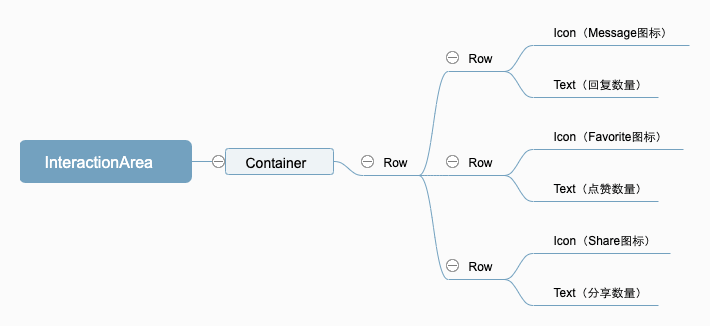
Widget renderInteractionArea()
{
return Container(
margin: EdgeInsets.symmetric(vertical: 16),
padding: EdgeInsets.symmetric(horizontal: 16),
child: Row(
mainAxisAlignment: MainAxisAlignment.spaceBetween,
children: <Widget>[
Row(
children: <Widget>[
Icon(
Icons.message,
size: 16,
color: Color(0xFF999999),
),
Padding(padding: EdgeInsets.only(left: 6)),
Text(
data.replies.toString(),
style: TextStyle(
fontSize: 15,
color: Color(0xFF999999),
),
),
],
),
Row(
children: <Widget>[
Icon(
Icons.favorite,
size: 16,
color: Color(0xFFFFC600),
),
Padding(padding: EdgeInsets.only(left: 6)),
Text(
data.likes.toString(),
style: TextStyle(
fontSize: 15,
color: Color(0xFF999999),
),
),
],
),
Row(
children: <Widget>[
Icon(
Icons.share,
size: 16,
color: Color(0xFF999999),
),
Padding(padding: EdgeInsets.only(left: 6)),
Text(
data.shares.toString(),
style: TextStyle(
fontSize: 15,
color: Color(0xFF999999),
),
),
],
),
],
),
);
} |
3.7 小结
通过上面的一个例子,我们成功地把一个看起来复杂的UI界面一步步拆解,将之前提到的组件都用了个遍,并且最终得到了不错的效果。其实,日常开发中90%以上的需求都离不开上述提到的基础组件。因此,只要稍加练习,熟悉了Flutter中的基础组件用法,就已经算是迈出了一大步哦~
这里还有银行卡和朋友圈的UI练习例子,由于篇幅原因就不贴代码了,可以去github仓库看。
4. 总结
本文首先介绍了Flutter中构建UI界面最常用的基础组件(容器,行,列,绝对定位布局,文本,图片和图标)用法。接着,介绍了一个较复杂的UI实战例子。通过对Dom结构的层层拆解,前文提到过的组件得到一个综合运用,也算是巩固了前面所学的概念知识。
不过最后不得不吐槽一句:Flutter的嵌套真的很难受。。。如果不对UI布局进行模块拆分,那绝对是噩梦般的体验。而且不像web/rn开发样式可以单独抽离,Flutter这种将样式当做属性的处理方式,一眼看去真的很难理清dom结构,对于新接手代码的开发人员而言,需要费点时间理解。。。
|


