|
The iPhone is one big constraint ― no keyboard, small
screen, few buttons ― so designing applications for the
iPhone is an exercise in building smart, simple software.
Bloated apps on the iPhone? You won't find many. Most
applications pick one feature or group of related features
and centralize the product around that central theme.
When Apple began crafting UIKit, the set of
APIs used to build the user interface for an iPhone
app, they had to see into the future and predict what
the most common application design models would be and
make sure those could be accomplished easily. It may
seem obvious to us now because we're so used to iPhone
application design but the high-level navigation and
interaction concepts available to iPhone application
developers are really quite brilliant:
Dive deep into hierarchical levels of application
information and then surface back to the top easily
Switch between different main pieces of functionality
without losing your place on one when moving to another
Edit and adjust information without losing your place
contextually
Display a list of information or choices
These three main interaction concepts correspond to
three different types of View Controllers: Navigation
Controllers, Tab Bar Controllers, Modal View Controllers
and Table View Controllers respectfully. These are the
building blocks for crafting iPhone applications.
Displaying Main Application Features
Displaying a list of available
features of your iPhone application so the user can
navigate through your app is a common practice. But
given the variety of ways to display structured information
in an iPhone app, which is the best way? What's the
best way to present entry points to an app's main features?
There is no best way but there are a variety of established
patterns you can learn from.
Things, iStat & Birdfeed
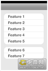
Things, iStat and Birdfeed are three iPhone
applications that have a variety (or variable number)
of main views, too many to fit inside a Tab Bar Controller
on the bottom of the screen. How do they deal with this?
They use a Table View Controller as the application's
main screen and list the main features there in a scrollable
panel. Each table row would normally display a Navigation
Controller once tapped.
Advantages:
Main app features available
in a simple, clean list design. Order & grouping
connotes importance of features.
Disadvantages:
No way to directly move from
Feature 1 to Feature 2 if within Feature 1's Navigation
Controller hierarchy, takes extra taps to get back to
main screen.
Squirrel, Tags & Tweetie
Squirrel, Tags and Tweetie utilize a Tab Bar
Controller as the main navigational
pivot for the application. (Note: Squirrel & Tweetie
have an initial view before their main Tab Bar Controller
view. Squirrel has a vault passcode lock and Tweetie
has a Table View of your saved accounts.) Typically
when using a Tab Bar Controller each tab item would
display a Navigation Controller and have a full feature
hierarchy beneath it. When pushing & popping views
within a specific tab, you can choose to hide the main
Tab Bar to give your new view more room on the screen.
Advantages:
One-tap access to switch between
main application features. Switching back keeps your
place within the Navigation Controller hierarchy (if
used).
Disadvantages:
Only works well when there
are less than 5 main application views. If an app has
more than that then the Tab Bar would typically show
a More tab item as the 5th, and secondary application
features would be tucked away below that tab.
ESPN ScoreCenter, Phases & Weather
ESPN ScoreCenter, Phases and the default Weather
app are examples of a flattened navigational hierarchy
where there's a single type of main view and a variable
number of them showing. Applications using this design
pattern are normally information-rich and designed to
be utilities rather than applications you spend a lot
of time in.
Advantages:
Natural gesture interface for
navigating between views, quickly display structured
information.
Disadvantages:
Getting from Card 1 to Card
4 takes a variety of swipes. No direct access between
views more than 1 card away. Useful only for flattened
(or nearly flattened) navigational hierarchy.
Follow The Leader Or Blaze Your Own Trail?
The application design patterns and examples
shown above work with nearly-default navigational models
that Apple has provided. They may customize the interface
elements but the general interaction concepts are stock
UIKit. There's nothing wrong with following standard
Apple conventions for navigating around your app but
what if you need to go beyond? What if you have a totally
custom paradigm? The following are examples of applications
that have defined their own interface paradigms.
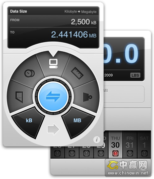
Weightbot & Convertbot
Arguably two of the most tactile
and beautiful applications available for the iPhone,
both the applications from Tapbots have completely custom
interfaces that center around a specific interaction
point they designed from scratch. For Weightbot they
use a horizontally-scrolling picker wheel and in Convertbot
they have a mechanical, spinning dial for selecting
units. There's a great at their blog about the making
of the Convertbot dial.
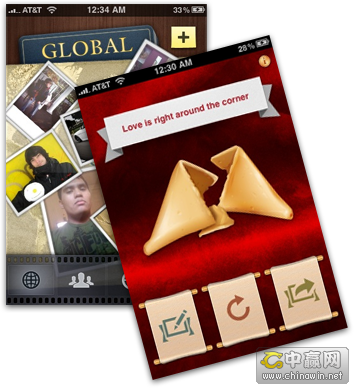
Collage & Fortune
Tapulous has been making fantastic
applications for the iPhone for awhile, and both Collage
and Fortune are less well-known than their big brother
Tap Tap Revenge. Fortune is a simple application that
lets you crack open a fortune cookie and read the message
but instead of going the simple route they designed
a totally custom interface for what is essentially a
fairly simple application. Simple concept + brilliant
interface = winner.
Collage is a social picture-sharing app that
redefines what a Tab Bar Controller paradigm can end
up as. Their totally custom film strip interface and
sliding, animating panels is some of the finest UI work
you'll find in the App Store.
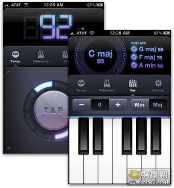
Beats
Beats by Bjango is a beat and
key-matching app for DJs and musicians. There are a
variety of custom elements but the main screen design
emulates a Tab Bar Controller in the middle of the screen
with the main content areas extending above and below
this tab bar.
Postage
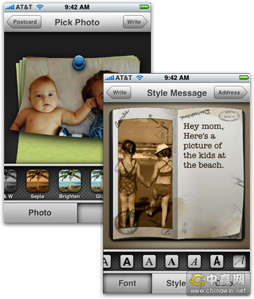
Postage by RogueSheep is an Apple Design Award
Winner and has an iLife-feel to the entire application.
Postage uses standard Apple UI conventions with a totally
custom implementation that perfectly matches the app's
postcard-creation workflow. An important part of Postage's
interface is the custom horizontal slider letting a
user choose a specific style or font from a group of
choices.
Choose What Works Best
There's nothing wrong with
using unmodified Apple UIKit elements and paradigms,
in fact most of the applications in the App Store and
those coming from Apple get along fine with the built-in
interface paradigms and objects. Apple's built a solid
framework to use when creating applications, but some
app developers aren't fully satisfied so they take designs
and interaction paradigms into their own hands. This
was a showcase of some beautiful interface design decisions
but be careful as it's easy to go overboard and screw
things up.
A good rule of thumb is this: if you can't design
something better than Apple, don't do it.
|