| 本节课我们将介绍,如何使用css在不修改图片源的前提下装饰你的图片画廊。这里用到的技巧也很简单,就是在图片之前创建一个<span>,并在span上使用background-image生成一个遮罩的效果。这种方式既简单又灵活,demo中介绍了20多种样式,大家可以参看。
这种css技巧带来的好处
- 节约时间 ― 你不需要在photoshop中创建图片模板,然后为每张图片生成独立文件。
- 保留原始图片源 ― 我们不用担心日后需要更换图片主题的时候,没有原图片。因为我们根本没有修改他。
- 相当的灵活 ― 你只需要调整css就能换一个完全不同的样式。
- 在任何站点都能工作 ― 这个css技巧在任何站点,任何图片大小下都适用。
- 解决浏览器兼容问题 ― 通过了大多数浏览器的测试 (Firefox, Safari, Opera,
甚至包括行为怪异的IE6)。
基本概念
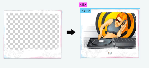
我们需要在包裹img的div中创建一个span元素,在他上面适用background-image来产生遮罩的效果。如果你不喜欢插入一个空的span标签,我们可以使用javascript来动态生成他,之后我们会介绍到。下面的代码揭示了他如何工作。
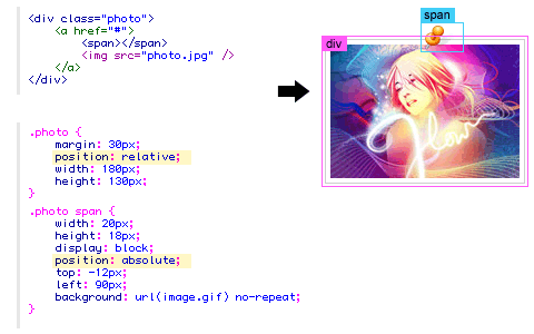
对于css代码,我们需要注意的是,需要为div设置position:relative,为span设置
position:absolute。这样你就可以通过为span设置top和left属性,来任意摆布他在div中的位置了。
IE PNG hack
为了能让透明的png图片在ie6中工作,我们需要使用到强大的 iepngfix.htc
hack。下载 iepngfix.htc 文件,并在页面<head>标签中添加如下代码。
<!--[if lt IE 7]>
<style type="text/css">
  .photo span { behavior: url(iepngfix.htc); }
</style>
<![endif]--> |
外观
我们只需要修改指定span元素的css,就能实现不同样式的变化。查看demo源代码,你会发现其中的奥秘。
jquery解决方案
如果你不喜欢在页面中直接添加空的span标签,可以使用下面的jquery代码,实现span的动态添加。
<script type="text/javascript" src="jquery.js"></script>
<script type="text/javascript">
$(document).ready(function(){

  //预添加 span 标签
  $(".photo a").prepend("<span></span>");

});
</script> |
#1. 简单画廊
让我们使用之前介绍的技术,来创建画廊吧。
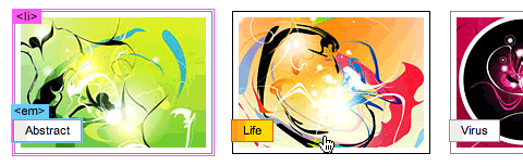
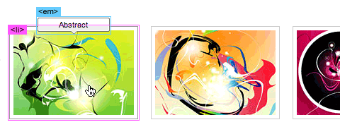
#1b. 迷你icon
这个例子为了展示了,如何在图片上面放置不同的icon。我们需要为span标签设置不同的css
class 名称。
#2. 带文字的图片
该例子为了展示了如何创建带文字连接的画廊。
#2b. 弹出文字
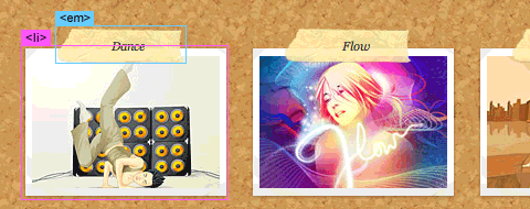
#3. 迷你纸夹
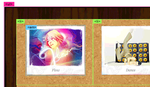
#4. 软木板画廊
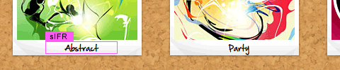
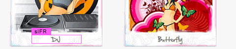
sIFR版本(文字替换)
在这个版本中借助 sIFR, 实现将em中的文字替换为手写体。
#4b.胶带效果
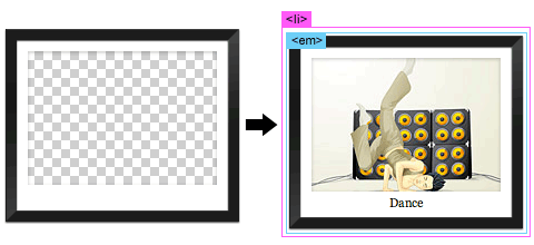
#5.黑框艺术画廊
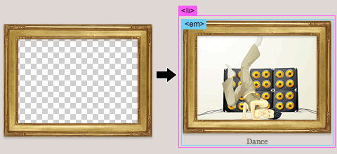
#5b.金边艺术画廊
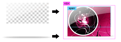
#6.水彩效果
sIFR版本
#7.高光效果
#8.木板画廊
最后我们展示如何使用background-image来实现木板的效果。
最后评论
我们可以看到这种css技巧相当的灵活,他极具创造性,他将图片和css有机的结合在了一起。你也可以使用这种方式,创建自己不同风格的画廊。
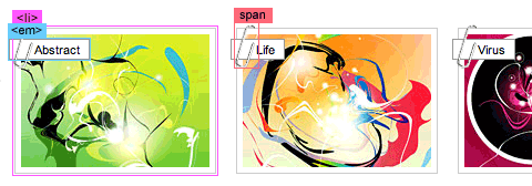
在上一讲中,我们的解决方案使用到了jquery去创建一个span标签。在这一讲中我们将用一种更好的解决方式,使用:before
和 :after 伪类。:before经常会用到,他可以用来添加额外的元素。
HTML
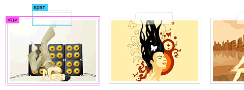
下面是一个ul列表代表的图片画廊。
<ul class="gallery clip">
    <li>
        <img src="http://webdesignerwall.com/wp-content/uploads/2012/09/sample-1.jpg" alt="image">
    </li>
    <li>
        <img src="http://webdesignerwall.com/wp-content/uploads/2012/09/sample-2.jpg" alt="image">
    </li>
    <li>
        <img src="http://webdesignerwall.com/wp-content/uploads/2012/09/sample-1.jpg" alt="image">
    </li>
</ul> |
CSS
下面是为.gallery设置的css,这里需要注意的一点是,我们需要为.gallery下面的a标签设置position:
relative。
.gallery {
    margin: 0 0 25px;
    text-align: center;
}
.gallery li {
    display: inline-block;
    margin: 5px;
    list-style: none;
}
.gallery a {
    position: relative;
    display: inline-block;
} |
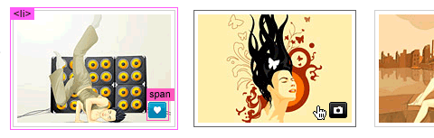
:before元素
我们将会为 :before 元素指定一个30 x 60px大小的曲别针背景图片。注意到我将css的content属性设为空值。没有空的content属性,容器就不会显示。
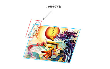
.clip a:before {
    position: absolute;
    content: ' ';
    top: -5px;
    left: -4px;
    width: 30px;
    height: 60px;
    background: url(http://webdesignerwall.com/wp-content/uploads/2012/09/paper-clip.png) no-repeat;
} |
艺术边框
利用这种技术,你可以再图片上添加任意的遮罩效果。下面的例子,我把图片背景换成了艺术边框。
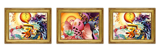
.frame a:before {
    position: absolute;
    content: ' ';
    top: -22px;
    left: -23px;
    width: 216px;
    height: 166px;
    background: url(http://webdesignerwall.com/wp-content/uploads/2012/09/frame.png) no-repeat;
} |
HTML5画廊
我们可以使用html5标签,创造更高级的画廊。下面的例子,我们使用<figure>包装图片,<figcaption>包含图片标题。
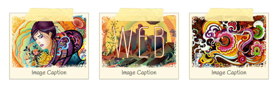
<ul class="gallery tape">
    <li>
        <figure>
            <img src="http://webdesignerwall.com/wp-content/uploads/2012/09/sample-4.jpg" alt="image">
            <figcaption>Image Caption</figcaption>
        </figure>
    </li>
    <li>
        <figure>
            <img src="http://webdesignerwall.com/wp-content/uploads/2012/09/sample-5.jpg" alt="image">
            <figcaption>Image Caption</figcaption>
        </figure>
    </li>
    <li>
        <figure> <img src="http://webdesignerwall.com/wp-content/uploads/2012/09/sample-6.jpg" alt="image">
            <figcaption>Image Caption</figcaption>
        </figure>
    </li>
</ul> |
CSS
css中我添加了两个:before,一个针对<figure>元素,另一个针对<li>元素。遮罩图片overlay.png被用在了figure:before上面,胶带图片用在了
a:before上面。
.tape li {
    width: 170px;
    padding: 5px;
    margin: 15px 10px;
    border: solid 1px #cac09f;
    background: #fdf8e4;
    text-align: center;
    box-shadow: inset 0 1px rgba(255,255,255,.8), 0 1px 2px rgba(0,0,0,.2);
}
.tape figure {
    position: relative;
    margin: 0;
}
.tape a:before {
    position: absolute;
    content: ' ';
    top: 0;
    left: 0;
    width: 100%;
    height: 100%;
    background: url(http://webdesignerwall.com/wp-content/uploads/2012/09/overlay.png) no-repeat;
}
.tape figcaption {
    font: 100%/120% Handlee, Arial, Helvetica, sans-serif;
    color: #787568;
}
.tape a:before {
    position: absolute;
    z-index: 2;
    content: ' ';
    top: -12px;
    left: 50%;
    width: 115px;
    height: 32px;
    margin-left: -57px;
    background: url(http://webdesignerwall.com/wp-content/uploads/2012/09/tape.png) no-repeat;
} |
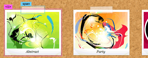
CSS3 Transform
在这个例子中,我使用了软木纹饰背景,并使用transform属性转变图片。
.transform {
    background: url(http://webdesignerwall.com/wp-content/uploads/2012/09/cork-bg.png);
    padding: 25px;
    border-radius: 10px;
    box-shadow: inset 0 1px 5px rgba(0,0,0,.4);
}
.transform li {
    border: none;
} |
Nth-of-Type
为了让图片旋转的更随机和自然,我使用nth-of-type去筛选图片,为不同图片设置不同的旋转角度。
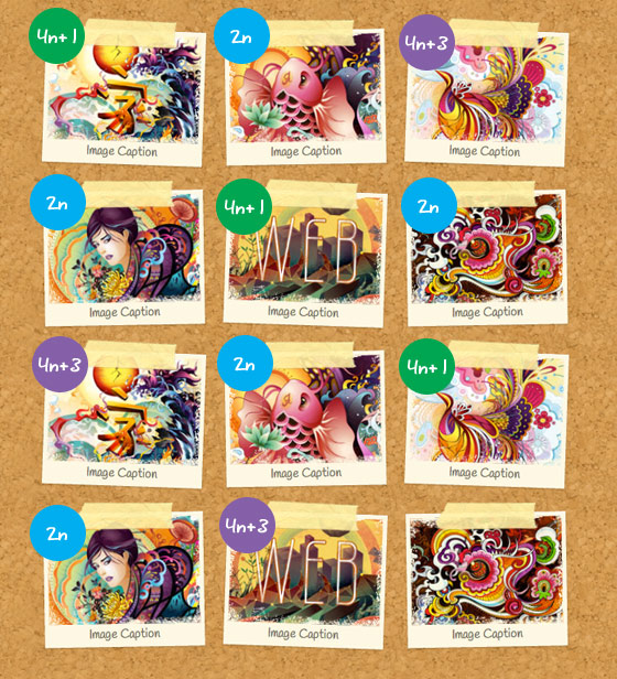
.transform li:nth-of-type(4n+1) {
    -webkit-transform: rotate(2deg);
}
.transform li:nth-of-type(2n) {
    -webkit-transform: rotate(-1deg);
}
.transform li:nth-of-type(4n+3) {
    -webkit-transform: rotate(2deg);
} |
|


